Rumors • Help Me Choose a Book Cover
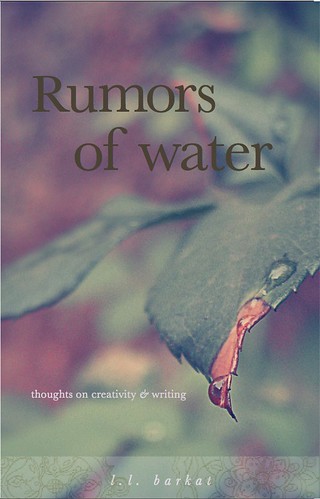
I always come to this place, of wanting to know. What do you love best? If you like one of these covers but have ideas about how it might look better, I'm ready to hear that too.
This is a book about creativity and writing. It is held together with threads of memoir.
You'll see how a writing life unfolds when shared with two daughters. You'll see the undersides of how I work and what I hope, when it comes to the art of writing. You'll see different sides of me: mother, writer, manager, editor, small-press publisher.
Mostly I hope you'll see some kind of beauty and grace. And a way to embrace where you are and where you want to go with your own writing.
Labels: Rumors of Water








25 Comments:
No contest. If those are the only two, the second one is more about water, the first is not.
Wonderful title. Very you, I think.
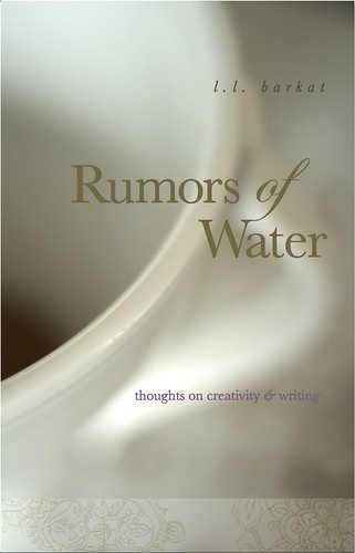
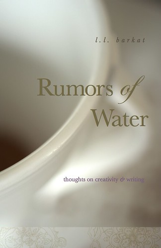
I really like the second cover, the one in white, because the artwork gives a feeling of flow, of being in motion, the way water is (so that ties in nicely with the title). I do not, though, like the ornamentation across the bottom, which reminds me too much of weddings or wallpaper. It takes my attention to a place on the cover that I don't want my eye to fall.
The second one. It's beautiful.
Cover #1 is alive, full of metaphor and tension, the water pooling and hanging on the leaf-edge, so like the writing process itself, sometimes a drip-drip-drip, sometimes a deluge...maybe the leaves could be a tad more green?
Cover #2 is nice, and expected, and white.
Maureen, I'll have to think about that. It is my little girl's designs that she does while she listens to stories. :) But I'll muse on how to use it better :)
i came to ask YOU a question.
you once mentioned a book that was good for learning all the different kinds of poetry...
what was that book?
Nance, you make me smile :)
My favorite is the Norton Anthology 'The Making of a Poem.'
I prefer the first cover. It is alive and vibrant.
The second one is less interesting- too much what I would expect a cover for a book of that name to look like if that makes any sense.
Hurray for you on the book, btw. :)
-A long time Google Reader lurker.
The first has more "texture"; the second is more "watery."
If I had to choose, I'd choose the second though I like them both.
How's that for decisive? :(
Karen Swallow Prior
Okay.. I'd mix them up a bit. I like the picture from the first and the fonts and placement of the text from the second.
I agree with John about the water on the edge, clinging with tenacity, like a creative spirit.
I'd say the first one, with a little less pink in it though. The second one doesn't strike me as a book on writing. It is a very aesthetic design, but it does look like wedding decoration.
I'm weighing on on the second one--love that flowy feel. I'm thinking about that ornamentation that Maureen mentions...not so sure about it quite yet.
The first one really caught my eye. I love the green.
The second one, hands down, I feel such peace just looking at it.
I see beauty and softness and grace in the second photo. At first I saw a cup of tea and thought of sharing it with you--but maybe it's a pitcher? At any rate, it sends my imagination soaring. And I like the the design on the bottom and the fact that it's part of your daughter.
the second one. But I have to contradict Maureen. I like the ornamentation across the bottom. :)
When I saw the first one I thought surely that had to be the one....until I saw the second one. It has a sense of serenity - just lovely.
Ok, what about this - the font and lettering from the second one over the top of the first background? There's something about the first background, and that drop of water. But I really like the font selection and size of lettering on the first.
I think I've become high maintenance!
Just realized HisFireFly had the same idea as me, only first . . . great minds!
I like the feeling of the white one better (like Maureen, minus the design across the bottom) upon first glance. But the more I've thought of it, I understand the first one is about "rumors" (I know you hate quotes in comments. Sorry.) of water, rather than water itself, so that cover really does makes sense in context. It just took me longer and I don't think the artwork is as enticing initially. Not sure that commentary is helpful but that's what I've got. :)
L.L. I love the concept of the second design. To me, it looks like a vessel or tea cup that needs to be refilled or replenished, and gives more meaning behind your title (I think).
#2
and
thanks for the book title :-)
The second one. I'm not sure why. I just like it.
I don't understand elements of design, so I guess you can just take this as the knee-jerk reaction of a reader who owns a ton of books.
Top (leaf): Your daughter's mandala-inspired doodles have leaf-like elements swirling in, and therefore seem like they fit thematically with the first cover. I like the image of the leaf and water, a nature theme, which is also a big part of your life. I like the font in white for the subtitle, but the main title seems sort of lost (maybe the color). Maybe you want that effect to support the idea of rumors? The thing my eye goes to first on this cover is the droplet of water. Then left, to the subtitle. Finally, third, to the main title.
Bottom (cup): The artwork seems to add an element of femininity to this overall design, perhaps because of the light, creamy colors and tone? Also, is the liquid at the bottom of the cup tea? And does that become a big theme in the book (I'm guessing it might be, because of your tea journey)? If tea is big in the book, that could work well. Here, my eye goes to the title first, then to the dark stuff at the bottom of the cup (I actually couldn't tell at first what it was), then to the subtitle, which sort of fades away into the shadow on the right. And then the design at the bottom.
I can't imagine that this rambling of mine is helping much.
Yup, the second one.
Post a Comment
<< Home