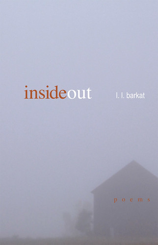
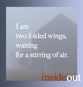
Which Cover Speaks to You?
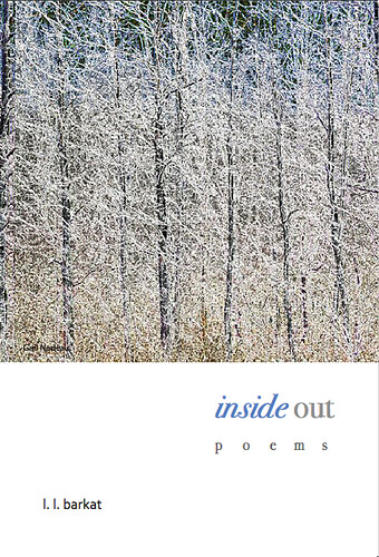
Take a stroll with me, and I will listen. The woods are quiet and we can take our time.

When you come to a clearing, look up and think. Is this the place? Is this how you feel when you are in my poems?
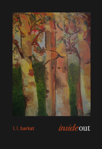
Maybe a darker scene will do? How does it feel? Right for the words you are used to from me?
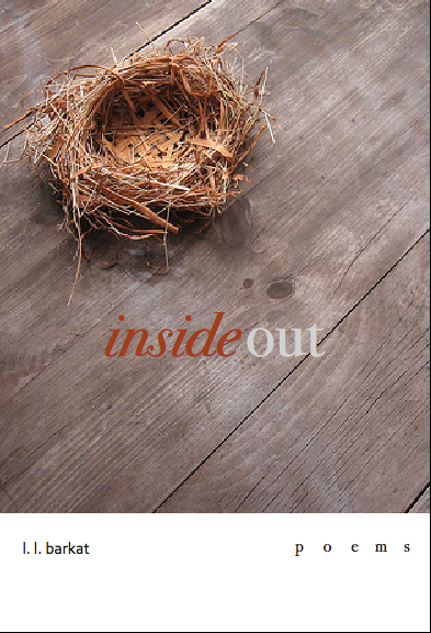
Or perhaps this is a better place? Does it evoke the voice, as you remember it in my poems?
You might think about it this way too: which would you prefer to set on your bedside table, or hold in your hands? Tell me your thoughts, and I will listen. The International Arts Movement, as publisher, will listen too. Come stroll with me...
POETRY FRIDAY:
Tweetspeak's The Walled Garden of Spices & Herbs










64 Comments:
I'm between the first one and the second one - leaning toward the second one. I like the first, because it's a very clean look, but the second makes me think poetry...
I like the first two the best, but especially the second for exactly the reason you mention. To me, poetry is at once a place of rest and of mystery.
I definitely think the first two fit your writing voice better than the last two. I love both the first and the second.
the first- has too much energy i the photo...for me.
the second- is just right.
the third- is growing on me.
the fourth- i like...except the title needs to be a "hair" lower and to the right...and maybe the word "inside" in black.
I LOVE the first one--at least against the dark background.
The first image made me gasp.
And it made me want to listen.
I like the second a lot. It evokes for me two things I like so very much about your writing: the evocation of the mystery of all that surrounds us, and the tugging and pulling, always, toward God; and the meaning of home, both our home here on earth and our home with God.
First two. Poetry is cryptic, or at least obscured, until further inspection. The first makes me inspect because there isn't anything specific to stop my eyes. That's good.
The second image plays more with the title and its colors: You don't know what's "inside" the building, and both "inside" and "poems" share the same color. Similarly, you know "l.l. barkat" on the "out"(side), and they, too, share the same color.
This gives me the greatest joy....
GREATEST joy.
To see possible coat for your poems, heading out into the world.
I'm partial to cover two. :)
A barn cloaked in fog. The simple as mystery.
This makes me very happy.
So happy for you.
A privilege to gather with this community and celebrate the beauty of words, the Word.
All's grace,
Ann
They're all lovely. The nest is my least favorite. I love the second one for its mystery and the third for its artistry. What a pleasant dilemma you're in!
I like them all. OK, so if forced to pick one, I'd say #2. Or maybe #3; it's kind of cool. And the one with the nest, well...
The BIG NEWS here is L.L. is getting her poems published! Virtual champagne and chocolate for everyone! Congratulations!
I like #2. But the bird's nest is cool, too.
Congratulations on the upcoming publication!
I like them all, but the second is my favorite. And the fourth. :-)
The first makes me think "loud" and "blinding."
But the 2nd...oh, that 2nd one... One of the things I find attractive about your words is that (in my experience) you don't spell it all out but leave plenty of thinking space for the reader. You stimulate and invite thought. So the misty #2 with no hard lines is perfect.
#3 has too much detail. See thoughts on #2 above :)
#4 is just okay.
But you didn't mention WHEN. When?!?!?!
the first one.
I like #1 and #4. the question of the nest in number 4 fascinates me.
I *love* the first one . . . it makes me think of the quiet that you find in a snow-covered woods, and the pristine condition everything there is in. Your poetry makes me feel similar.
I also like the (apparently) controversial 4th one. Nests hold so much promise and, when they're empty, so much loneliness. I've seen both in your poems
4. The metaphor in connection with the title appeals to me. I think the changes suggested by nAncY would make it better.
I like them all but today the one I like best is the second one because my day is so full and cluttered, I am nourished looking at such a sparse, bare image.
Any of them will work, but maybe I prefer the second and fourth, and maybe in that order. I look forward to seeing that book in any of those covers in our home and really growing in love for the genre of poetry through it.
Wow , so thrilled for you, and when?
#2 is perfect fit, and yet # 3 reminds me more of your art
The misty house is still my fav...good work Laura! Can't wait to read them.
The stark winter scene #1 gets my vote. Draws you right in, resonates with the title.
The third is so rich. They're all good, but I'm drawn by the depth and artistry of the third.
As with anything, art will appeal differently to each viewer, but here goes....
The first seems cluttered to me, with too many trees. It rushes past like driving scenery, rather than that place where something catches your eye and you stop to look closer. It also feels cold and distant.
The second is chill, but there is hope in the outline, an evocative impression of nearing warmth and potential for wandering in the hidden distance with a secure place to which to return.
The third made me think of your art. It doesn't seem dark at all, but rather I have the feeling I get when wandering through the woods, seeing the brighter light of a clearing ahead. Also, the closeup on the trees makes them individual and unique, they aren't lost in the crowd like in the first image.
The final cover speaks of both sorrow and joy, depending on how you look at it. Either growth as a bird leaves it's nest, and the process and craft a bird puts into building it, or loss when an egg is taken. I prefer the first. Of them all, this is most visually compelling for me. I like the contrast, the natural textures, and the symbolism. So... um, I hope this helps.
I like #4 except there's a problem - the nest is empty and abandoned - and you are not.
So, I vote for #2 but something different on the type - I like the soft edges - they evoke the same feelings in me as your work - identity but softer, never backing me into a corner but always making me look to be sure I see what I think I see.
i wonder what #1 would look like at 100%...maybe the buzz i see in the branches would soften out.
and
with #3, i would like to see that one with the outline of the book, because with this view it compares smaller than the others without a border. still growing on me.
Wow, congratulations!! No deep thoughts, I just like #2. Look forward to enjoying a whole book of your poems.
I like number 2 best!
I like the second one best. I'm not sure why, but when I saw it it just seemed right.
How wonderful to have your poems in a beautiful book. I'm so happy for you.
I'd have to say either the 2nd or the 4th. The first is marvelously beautiful, but I feel like I've seen its style often. The third is quite gentle and warm, but doesn't have the presence of 2 and 4. Two has such an ethereal beauty; 4 is rather just striking, and bold. And I like the text layout on them too--especially 2 and 4. Quite a nice set of choices you give us!! :)
Mmmm. I like the idea of the last--empty nest--the best, but not the picture itself. Really, though, I'd be thrilled to have *inside out* on my bedside table in any garb. Woot, woot, woot!!!!!!!
Definitely the first one.
ok...#3 is now my fave.
just like a relationship, i had to get to know it.
it has soul, and projects the feel of something made from your hand.
it is more personal.
however, the word "poems" must must must go under the words "inside out".
. p o e m s . all spread out
maybe in a slatey green colour or a grey.
the more I scan back and forth and in between, the more deeply I settle into that last, so simply perfect...
I saw the first and my heart skipped. It reminds me of those photos you see and you must look very hard but if you look carefully enough you realize there is another picture hidden inside. Isn't that what poetry is, after all?
The second is my second choice. Beautiful as well. But the first - something stirring in that one.
l.l this is a wow wow wow moment! i celebrate with you!i rasie a toast to you and to the work He is completing in you...
as for the covers... definitely the last one. i want to have that one on my bookshelf.
sorry raise...
I imagined them all laid out on a table and reached out a hand - to number 2.
the last one. without a doubt.
the nest is a perfect image to companion your title. words nest in the heart of the writer and in the heart of the reader. poems are winged creatures. the natural elements are photographed simply which draws me to open the cover.
No 4, but I agree that the nest should not be empty, seems like something is missing. Second choice is 2, with different (darker) colors, for me the light blue is too much and blinding. Looking forward to this being published!
Really? Your poems?
I'm jumping for joy over here! You know what I think of your poetry.
I'm leaning to number one and number three. Just gorgeous, all of them. I like the starkness of the first one...a clean slate for your words. And the third give me joy to look at.
This week's RAP here (I know, it's early):
http://monicasharman.blogspot.com/2009/11/next-time-martha-had-jesus-over.html
I like the 3rd. The painting of the trees on black background. It has a character about it.
The first two are very clean and contemporary and the third reminds me of blogging :)
Number three is different, warm, intimate and I like the way that the word poems kind of gets lost or rather maybe camoflaged!? in the woods.
After looking at these covers for a few days, I have decided on no. 2 but I think it should be less blue and more gray. anon
I prefer the second. it speaks of timelessness, transcendence, and solitude. It is the only cover that makes me feel as though I am changing my context as I open the book to read the poetry within.
I like the idea of the the little birds coming out of the eggs and leaving the nest
I would purchase what's behind door number one please, Bob!
I would be drawn to pick this book up off the table and venture inside.
You're so cool to me. I'm serious.
I agree with Kelly, except I lean toward the first.
#1...love the stark. The trees.
There is just something in that cover that jumps out.
love it.
I was wavering between the first and the last - but my first thought was, the first, so I'm going with that.
I like the first two images best. The second has that tree or smoke or whatever that enigmatic smudge is next to the barn. That is the only reservation I have on that cover. I like the first one better, but instead of looking at the trees horizontally, I would imagine you to be best represented looking upwards. You know, laying on the earth, facing the sky.
I'm sure I'll like whatever you choose; you have excellent taste.
2nd one in a smokier color... It says something mysterious... like I need to get inside that barn full of poems :-)
We decided we like the very first one the best. We is my daughter and myself. She is 12. We said it makes us want to open it and the wintery trees are warm. It reminds me of where I would be while reading it.
Warm and quiet and in solitude.
That makes me want to read it!
Wow. How exciting! We get to have a voice for the wrappings of your heart in poetry...
#2 Hands down. The fog calls us to sit and wait for it to lift. Poetry is like that -- it beckons us to pause and exhale, as the meaning of words unveil what's within.
I also like the color - "inside" is red - which conveys passion and heart. It stands out from the gray of the background, which is the ordinary of our daily lives.
Congrats! I am SSSSOOO happy for you! Thank you for sharing the moment with us.
I'm late to the party. Typical...
Perhaps it's too late to vote, but certainly not too late to offer my congratulations and join in the excitement over your words.
As for the cover: I've stepped into each of those scenes when I come here. But mostly -- and again almost immediately today -- the color and depth and contrast of #3 seems a perfect fit. Reminds me of the vibrant word-pictures you paint.
But truly ... all are lovely. A reflection of lovely you...
Grace and peace, sister. Thanks for including us in your journey.
I like the second - the fog and the refuge to me represents the soul and the need for a place to find peace ----bkm
Poem for this week's Random Act of Poetry: http://faithfictionfriends.blogspot.com/2009/11/apple-pie-late-harvest.html
I decided to use my tweets from the jam for a series of new, related twoems: "Love Uses Spices and Herbs But Sure Is Different". Here's the link:
http://writingwithoutpaper.blogspot.com/2009/11/love-uses-spices-and-herbs-twoem.html
Just as He is glorified in Seedlings, I am excited to see the same in your new book. It has been a wonder walking along the poetry path with you (wink to Laura) after I stumbled in many months ago. From what I have gleaned about you, cover 3 seems most true. Although I fancy snow and barns, those painted trees do beckon me and stir me, much like your words.
Blessings and congratulations, miss L.L.
My poem for R.A.P.
When I Grow Old
L.L.,
For some reason, I like the first two. Perhaps that is because these look like covers that fit with your writings. (I mean that in a very good way) :) Anyway, these are some very nice options.
Post a Comment
<< Home