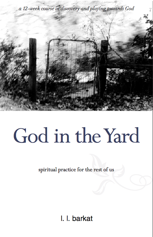
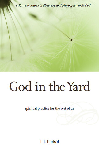
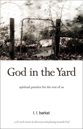
Book Cover: Thoughts?

posted by L.L. Barkat at 9:34 PM
![]()
![]()
Writing • Art • Poetry • Life • You know, stuff • L.L. Barkat
 Simple, fun, enriching poetry prompt e-book
Buy Inspired: 8 Ways to Write Poems You Can Love
Simple, fun, enriching poetry prompt e-book
Buy Inspired: 8 Ways to Write Poems You Can Love

A writer's story Buy The Novelist
 An Annie-Dillard style book on writing and creativity, Rumors was twice named a Best Book of 2011Buy Rumors of Water


 Mix Richard Foster and Annie Dillard in a blender, and you'll pour out God In the Yard... —Ginger Kolbaba, Editor, Christianity Today's 'Kyria'
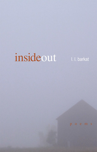 This book startles in its revelations... —Ann Voskamp, author 'One Thousand Gifts'
 The only writer I know quite like Barkat is Eugene Peterson. That probably tells you all you need to know. — Scot McKnight, author 'The Jesus Creed'
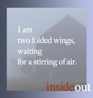

 Mom Stories
Previous Posts
Mom Stories
Previous Posts
|
NobleW Blog Ring
Join | List | Random

|


39 Comments:
L. L., my preference is toward the first one. The second that you have listed is my second preference. The third one is my least favorite.
I look forward to reading this!
I like them all, but prefer the last one.
I like the image with the gate, because that better conveys the "yard". I think, however, the text at the top gets lost in it.
There seem to be two subheadings and too many words consequently competing for attention. I'd use just one subhead with the title, maybe along this order:
God in the Yard
a 12-week course in spiritual discovery and play
I prefer the last one . . . you didn't ask why, but somehow the image seems to lend itself more to simplicity and a lack of busyness more than the others, and I like that in the context of the title and subtitle.
I meant to add, I would also not use the scroll or leaf on the right-hand side of the cover unless it were balanced elsewhere on the left or impressed in the paper as an all-over design. I don't think it adds to the cover at this point.
And congratulations on bringing this out!
Either one with Kelly's gate.
Releases when?
Yes, I like number one. But I agree with Maureen that the text at the top seems to be swimming there.
May I jump for joy yet?
Hey L.L. I like the middle one the best. I guess the blue seems to go well with the black & white. The brown color would look better to me if the picture was that "brown & white" antique look. I like the words at the top of the picture, yet have to agree, they seem lost inside the picture. perhaps if they were bold, or just under the photo?
however, never having published a book perhaps I should just keep quiet.
I'll like them all -- but I think I lean toward either one with the gate.
I like the coloring of the last one. But prefer the picture of the gate. Which I guess my vote basically cancels itself out, doesn't it?
On a different note, here I sit, late is the hour as I work on a blog post (ironically about finding God in my Backyard) and then I stumble over to your blog and find...God in the Yard. Wow.
I think maybe He is trying to tell me something :)
You need to slow down on the publishing books thing...I am having a difficult time keeping up with my Amazon purchases.
I like the second one, I think the text colour suits the picture better. However, I also agree with all the points Maureen made.
I vote for the first one. The maroon text of the title makes it stand out more.
And I always like to be really clear about which book I'm about to read. ;)
We haven't talked in ages... how are you?
I like the picture of the gate, but the color in the last one. I'm wondering if you could have color in one of the first two.
~ Wendy
Knowing nothing about the content of the book, I will simply offer that I agree with what others have said - having an image to connect with the "yard" theme in the title is effective. However, the image seems to connote that something ominous might happen in the yard - it's kind of a dark feeling behind the photo. Whereas the third picture is light and filled with hope and beauty - it seems to say that the yard is a warm and welcoming place.
My two cents.
I agree with Maureen about the placement of the lettering over the photo and the two-subtitle effect. But other than that, I love the layout. It's fresh, leaves a bit of room for the imagination.
And I have to say, I didn't see the dandelion working last night. Wow, though.
I like the 3rd one best; the gate image feels a little creepy and overly dark to me. Also, the words at the top are much more readable on that cover.
I prefer # 3. I like the green, more comforting.
Maureen is genius! What a great eye she has and what great advice.
#1!!!
the last one...
Another thought I had (which might be possible with photoshop): Could the gate image be extended in such a way that ground in front of the gate fills the remainder of the cover, with the title/subtitle suspended within that ground? It would keep the cover from looking so cropped or sectional.
I like the last one - it makes me feel content somehow.
the first!
After this many comments, you probably don't need more. I'm not fond of the gate. If it were blown up to cover-size maybe the yard beyond the gate would appeal, but in this small form the gate seems to shut out a cluttered, or junky space, or even, as one commenter put it, sinister.
The one with the seed heads is nice. I could go for it. But I'd like it better if there was more contrast between the white fluffs and the background. Again, maybe at cover-size it would show up as "airy", but in this size it doesn't give full attention to the fluffy white lines.
Are you locked in to having one or the other? If your e-mail accepts file-attaches, I'm going to send a couple of my photos that give a different suggestion.
The statement "for the rest of us" in sub-title didn't engage me. Who are we, those who are the rest of us, and why is it important that we be the rest of us? I like Maureen's slogan of "spiritual discovery and play."
The first one brings me in to see what it is and it is more striking to the eye. The last one seems more appropriate but that's why I don't think it would work. Seems like a Hallmark card! (and if that is your photo, sell it to them!)
Just a wild thought...what if the gate were on the bottom of the cover and above it a faded image of more garden over the rest of the cover, behind the words? Not so much a clear image but the hint of garden. You could even add a little color to the gate image (and garden beyond) without making it a "color" image, using Photoshop to color just a few things or to put in some faded, grainy color. I don't know if I can describe what I'm thinking well with words. Just a crazy thought!
I can't wait to read this, L.L.
I think one of your paintings should go on the cover.
Here I am again. Saw this on facebook, and didn't see the difference in color there as I do here (or maybe because it was brought to my attention). So maybe I'll just copy from there and paste, though it looks like I'm on the losing end:
I don't know. I like them both. But maybe at the moment the latter. It seems to convey to me a kind of wonder that goes along with the idea of God in the Yard. One could say that the former is good in showing how God is present and active in the ordinariness. But I probably lean to the green cover.
I like the first one. The gate invites you to come into the yard, and the color of the title is more appealing.
First one is the only one, just like it is. :) Ha.
Pls don't coldly desecrate the sacred with "12 week course"
You asked - I'm blunt. You're an easterner, you don't mind? :) I would pick it up, but then I do have sentimental ties to that gate........
No 1! :)
Kathleen,
She could say:
God in the Yard
An Invitation to Spiritual Discovery and Play
how about...
God in the Yard
even if you live in a small, 4th floor apartment in New York
God in the Yard
who let the dog out?
God in the Yard
a dozen delightful directions to discovery
God in the Yard
bar-b-que tonight, bring a side dish, wine provided
God in the Yard
watch your step
the gate invites me to open the book.
so happy to see kelly's image here.
agree that the words get lost in the gate photo though.
The reason I don't like the first two is the initial reaction I get is an unkempt yard. So because of that would lean toward the third
i like the gate ..BUT the third is easier to see...the lowly dandelion and yard go together in my mind...especially ...i like the "cleaner" visual look...makes me eel more peaceful
I like the B&W photo, but was drawn more to the color in the last. I think a little color is important for such a subject.
The first two are very beautiful, artistic, and conjure up lots of thoughts about opportunity and entering. But the third, that's the graphic that, for me, most conveys the idea from your subtitle - playing! Many people can identify with the idea of running through a field of dandelions, blowing the "flower" and watching the seeds fly away.
Post a Comment
<< Home