Rumors • The Book Cover, Take Two
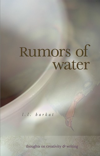
Listening to your feedback, I wonder if this might work...
:)
___
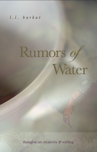
Maureen, here it is with the other text :)
Labels: Rumors of Water
Writing • Art • Poetry • Life • You know, stuff • L.L. Barkat


Labels: Rumors of Water
posted by L.L. Barkat at 9:00 PM
![]()
![]()
 Simple, fun, enriching poetry prompt e-book
Buy Inspired: 8 Ways to Write Poems You Can Love

A writer's story Buy The Novelist
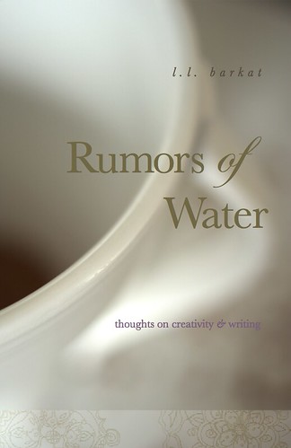 An Annie-Dillard style book on writing and creativity, Rumors was twice named a Best Book of 2011Buy Rumors of Water
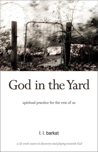 Mix Richard Foster and Annie Dillard in a blender, and you'll pour out God In the Yard... —Ginger Kolbaba, Editor, Christianity Today's 'Kyria'
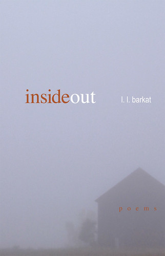 This book startles in its revelations... —Ann Voskamp, author 'One Thousand Gifts'
 The only writer I know quite like Barkat is Eugene Peterson. That probably tells you all you need to know. — Scot McKnight, author 'The Jesus Creed'
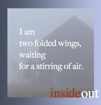
 Mom Stories
Previous Posts
|
NobleW Blog Ring
Join | List | Random

|
7 Comments:
Part of what I really liked about the second cover originally was the font and also where you placed the cover text. The original has an appealing elegance.
The text placement on the current version looks off to me, and with this font the cover generally does not have the same feel to me. Still like my original choice best.
(Wondering what ornamentation would look like around the object's rim, rather than as banner.)
what are the dimensions of this cover?
5.5 x 8.5
Such a fun question. :) (What will you do with the answer? :)
don't really care for this one
You're a good sport to put this out there...nah, the combination doesn't work...I don't know you or your work very well but it seems like those who do (Glynn and Maureen) have given you solid responses on #2 (looks Barkatish or elegant)...that's good feedback...one last thought (I work for a pub house) is just remember that a solid white cover almost disappears in a print catalog or even sometimes on Amazon, so maybe a thin color border to frame it...I'm anxious to read it!
I am with maureen -- I like the appealing elegance.
And I really like what John wrote -- I didn't know that!
I agree with Maureen - I liked the second take in your first selection.
Post a Comment
<< Home