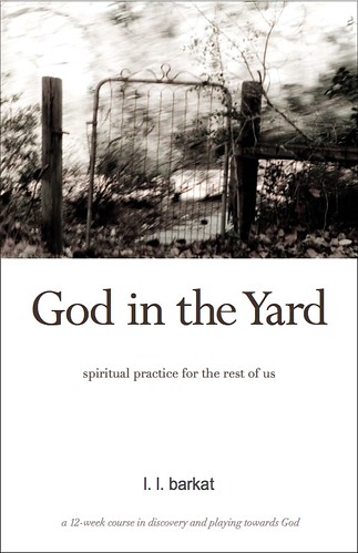
Rumors • Book Cover, Take Three

The back cover is a place to do things too. So I'm thinking this might be a way to keep my dear Little One's designs— even give them more play.
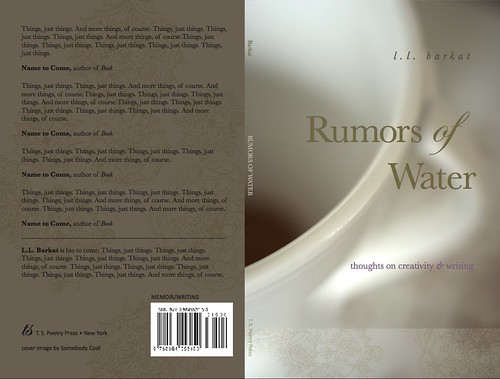
I felt there still needed to be a nip of hand-drawn design on the cover. It adds something of the human. I am still undecided about whether I should go with the nip or the ribbon across the bottom.
Click to see large nip cover.
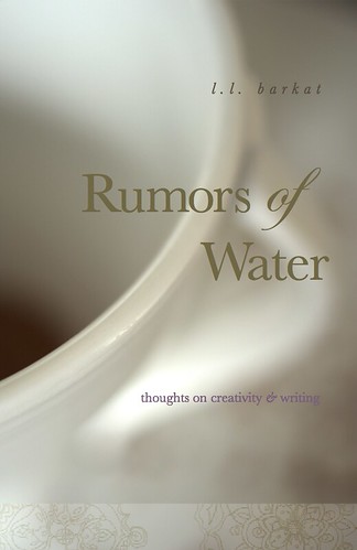
Click to see large ribbon cover.
Well, in any case: Take Three. :)
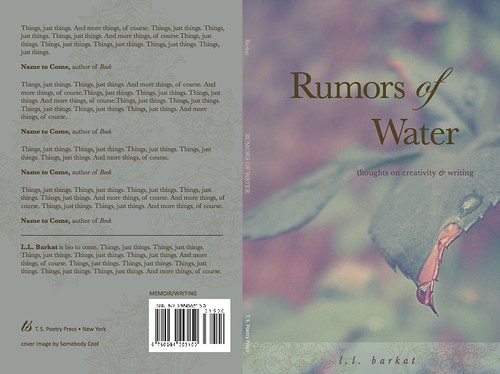
Take Three and a Half:
Click to see large image of Whole Leaf cover
Labels: Rumors of Water
posted by L.L. Barkat at 9:54 AM
![]()
![]()


15 Comments:
Little nip cover looks amazing - front and back!
Love what you've done with design on back cover.
Another possibility is to have the design on the spine, so it looks like it's wrapped onto the back cover.
No input on covers, just a note to say that I think you (and your daughters) are TOO COOL.
Can't wait.
1st Choice then as of this post: the NIP. 2nd choice: Whole Leaf.
I love the hand-drawn design on the back cover; it is beautiful. Looking forward to reading your book!
Ok-- throwing in my two cents about the book covers, if it's worth that much :). Both images are lovely. It's a hard choice and I don't think there is a wrong one. My personal favorite is the leaf. I love the water dripping and find the image and color of the photo inviting and intriguing.
I like the nip too. But I also like Maureen's idea about the nip wrapped around the spine. How about a little nip on front and back, wrapped around the spine?
So very exciting.
I am completely distracted by the "things and things and things" on the back cover as filler. Cracks me up!
I like the whole leaf version best.
May you have a blessed day.
I like the leaf cover with your title but love, love, love the other cover as well. Perhaps another book? I immediately thought about what happens when I drink a cup of coffee by myself, I write, and with another, share and collaborate.
I like the ribbon cover with the cup. The leaf cover is cool too, but the font color makes the leaf cover too heavy, weighty. The font color seems to make the entire image darker.
I think the coffee (tea?) cup seems more thirsty than the leaf, maybe that's why I like that image a little better.
I think that back cover artwork is astounding and beautiful. I can't wait to read this book!!
i like the ribbon and cup.
Totally in love with the last design!
I saw these images at Flickr before I saw this post and discussion. I thought that the little nip portion was an example of what was going on the spine, then I see Maureen's suggestion of making that so. I readily agree with that design on the spine. I think it ties the front image and colors to the same on the back. I like the crispness & contrast of the first image.
It's all beauty.
Blessings.
I have been at the coast for a week and the cover of the very first one is stunning. Absolutely.
HOW exciting!
I think I like the leaf best [I'm partial to green, & it's the color most pleasing to the eyes]
Post a Comment
<< Home